Context-Driven Interaction
The UI had to remain rock-solid and intuitive while driving on rough terrain, where precise touch targets and clear visual hierarchy are non-negotiable.
Designing a modular multi-display cockpit system that balances personalization, safety, and seamless physical-digital interaction.
Client
Volkswagen
Duration
4 months
Role
UI Designer
Tools
Figma
Disclaimer
Due to NDA restrictions, this case study mostly uses official press images, as working files like Figma and internal process documents could not be shown.
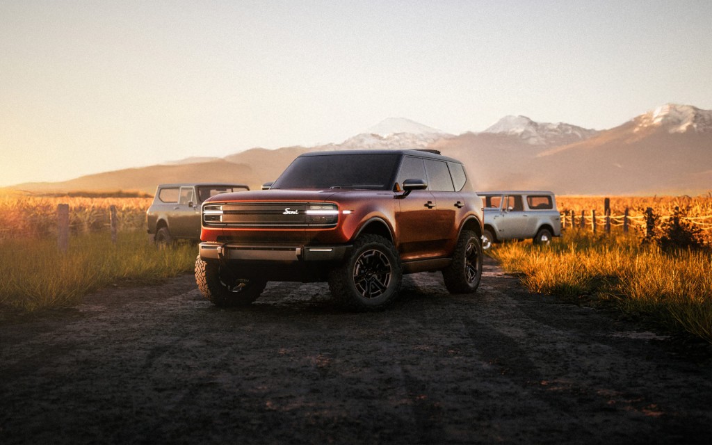
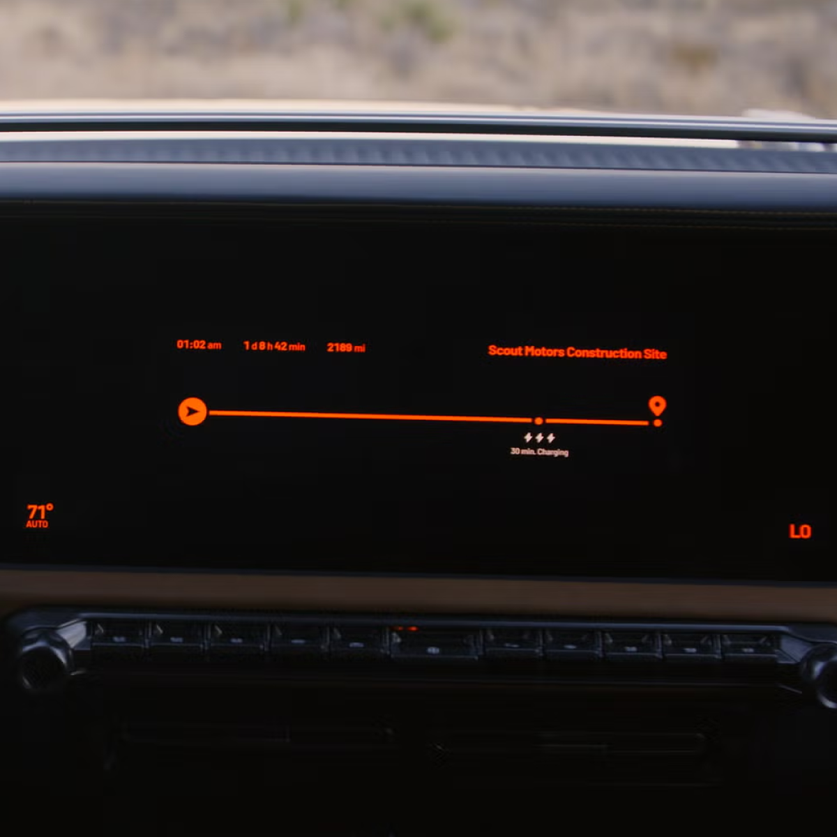
The challenge: in-car UI for Scout—Volkswagen’s revived off-road SUV—that holds up on trail and on longer stops, stays safe and glanceable with a moving cabin, and reads as a coherent outdoor-adventure brand across the main displays.
Business impact goals
01
Keep deep personalization available without raising cognitive load while driving.
02
Balance physical controls and touch where safety and trail context allow.
03
Align HUD, Driver Display, and CID on one coherent interaction model.
These three principles carried from problem framing into research as the non-negotiable outcomes the concept had to satisfy.
The UI had to remain rock-solid and intuitive while driving on rough terrain, where precise touch targets and clear visual hierarchy are non-negotiable.
I needed to integrate complex off-road telemetry and tools (maps, vehicle pitch, media) into a flexible layout that could adapt to the driver’s immediate needs.
As a vehicle for adventure, the experience had to be shared. I explored how to distribute control between the driver and passenger, ensuring the cockpit felt like a collaborative mission control.
Structured sprint reviews reduced ambiguity and accelerated UX alignment across disciplines.
Micro-workshops sharpened which interactions must be immediate, safe, and glanceable while driving.
I combined fast daily design-and-feedback loops with small discovery and design-thinking workshops that rotated the brief each time—so I could pressure-test shared-cabin moments, trail motion, and heritage cues in parallel without getting stuck on a single story. The image cards below show how those pressures showed up in concrete explorations.
Approach
Short cycles with UX, UI, HMI, and engineering—concepts went up early and feedback returned the same day, tied to hardware and safety reality.
Compact sessions with rotating questions and use cases so each pass stressed different cabin, motion, and brand-readability demands instead of defaulting to one storyline.
Rough-surface driving: maximum glanceability, resilient targets, and telemetry that stays readable when the cabin is in motion.
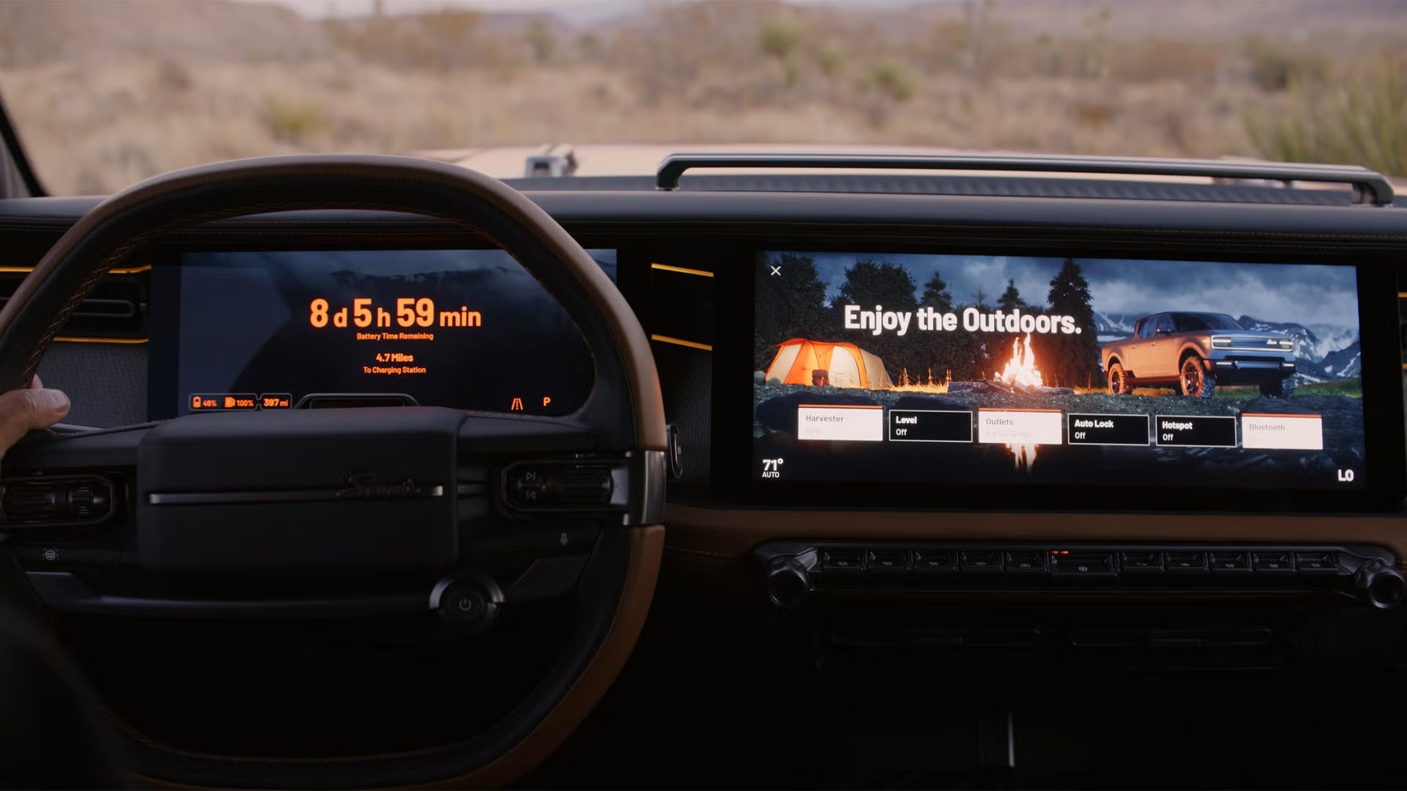
The vehicle as basecamp: longer stops, shared screens, climate and power-aware flows that feel calm rather than dashboard-busy.
Brand heritage cues: a deliberate mix of tactile control expectations and modern digital surfaces—nostalgic tone without dated usability.
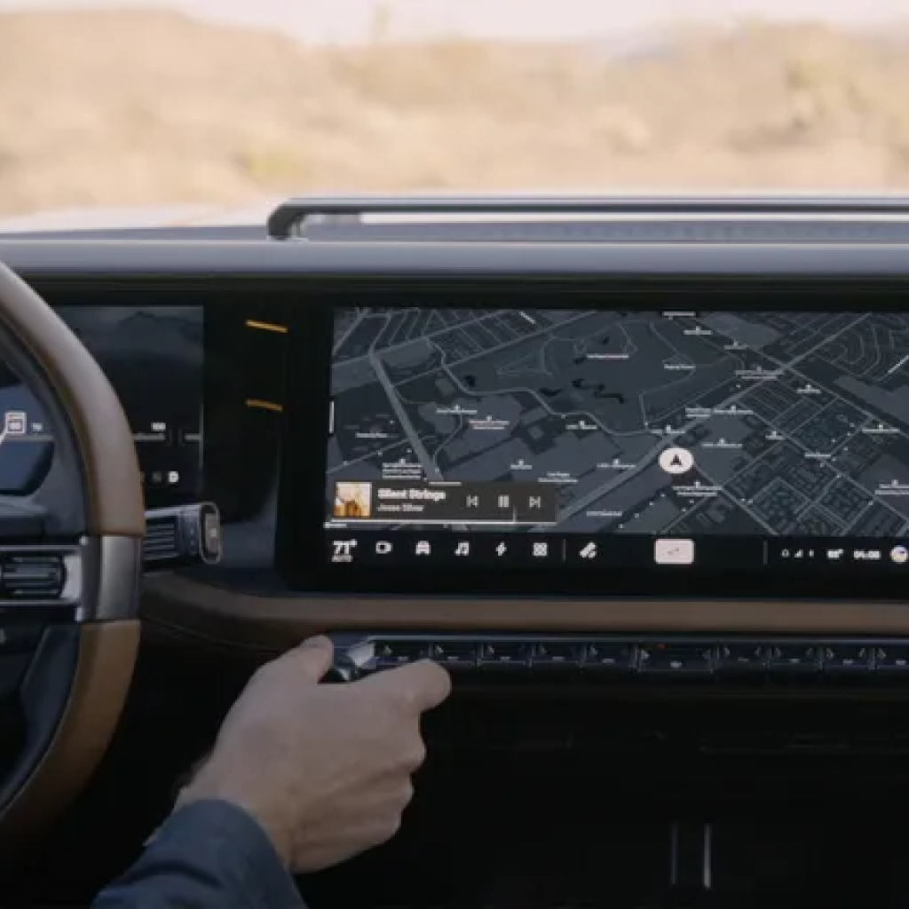
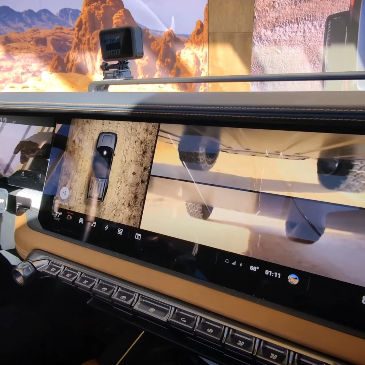
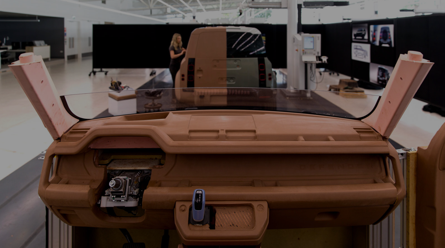
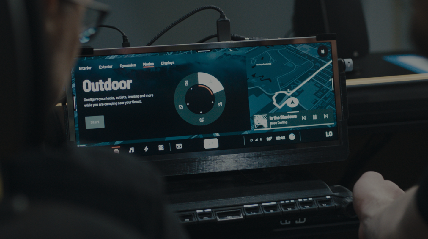
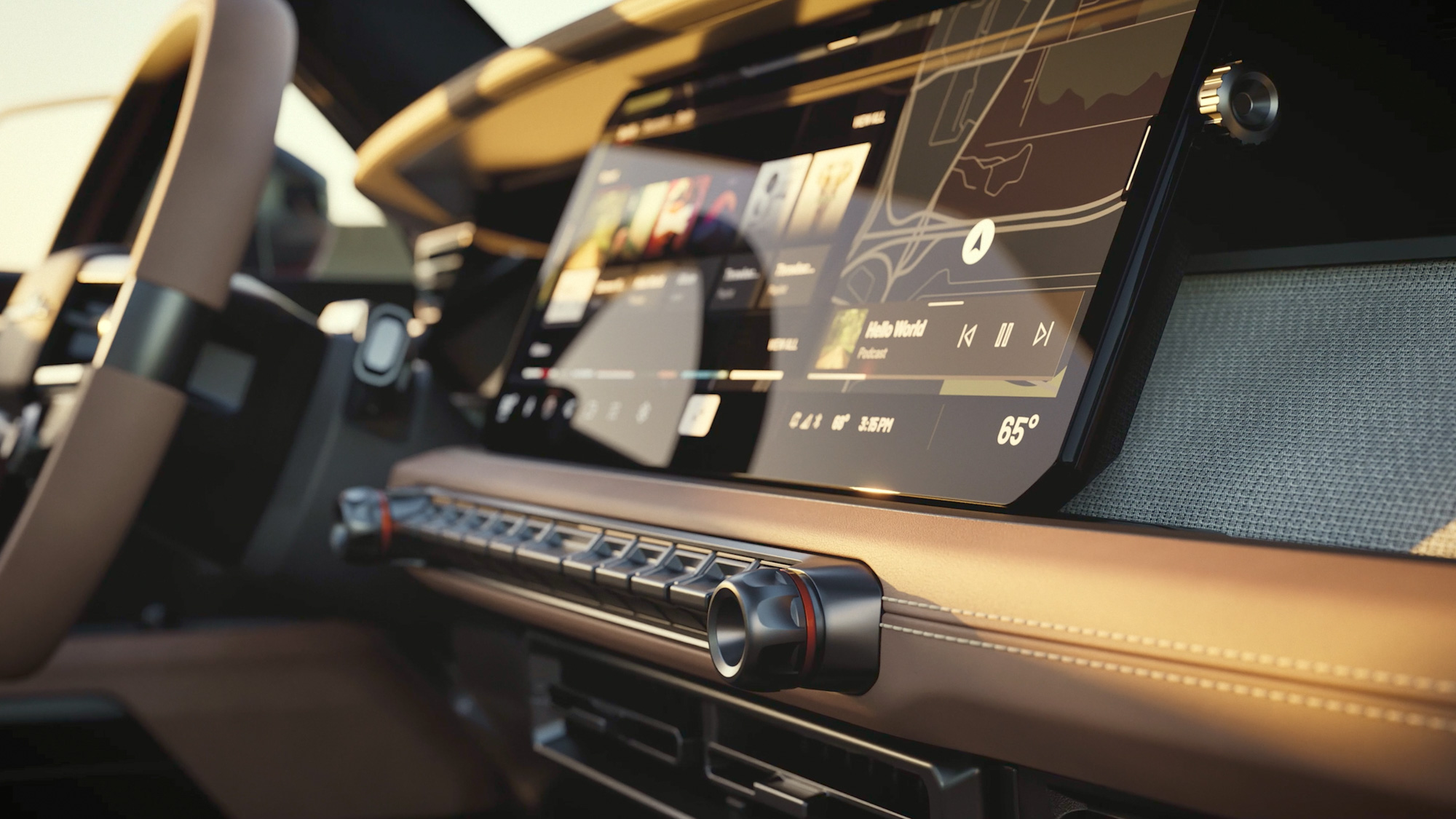
My work focused on the Central Information Display (CID), building upon the established visual language of the driver’s cockpit. I conceptualized a modular dual-rail system to expand the CID’s functionality for off-road use without disrupting the overall interior harmony.
I explored a twin-widget architecture that keeps the middle of the CID free for the main task while left and right rails surface supporting tools on demand: double widgets allow simultaneous access on both sides, vertical swiping enables fast switching within a rail, and collapsing widgets into slim handles creates display space without removing quick access.
Widgets can live on both the left and right edge so supporting information stays available without taking over the center screen.
Within a rail, vertical swiping allows a fast switch between widgets instead of forcing deep navigation or full mode changes.
Widgets can be hidden to create more room on the display, but remain instantly reachable as slim edge handles.
To move beyond desktop assumptions, I tested the interfaces in physical in-car prototype setups. That made it possible to validate interaction feasibility in realistic postures and movement conditions.
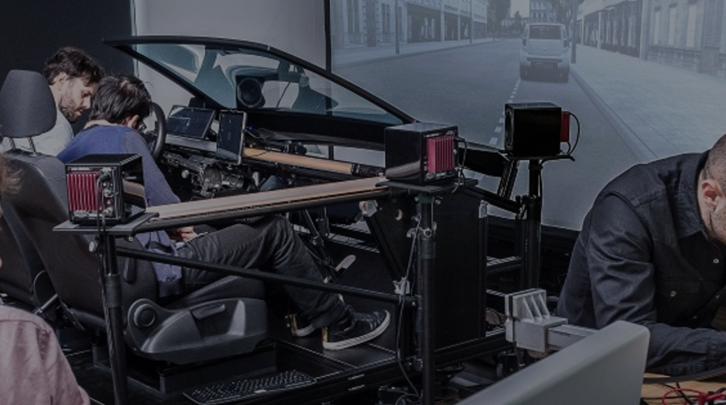
Hardware-in-the-Loop Test Setup
Real steering wheel integration · Adjustable display mount configurations · Alternative physical button mappings · Task timing and glance behavior checks
Validation Focus
Ergonomic Reach & Targeting
Interaction zones were iterated with Fitt's Law in mind to reduce movement effort and improve confidence while driving.
Eyes-on-Road Priority
Flows were refined to minimize eye distraction by reducing deep menu dependencies and increasing glanceable status feedback.
Physical-Digital Consistency
Button mappings and touch interactions were aligned so behavior remained predictable across modalities.
Defining power dynamics in a shared cabin.
In a shared off-road mission, control is a safety factor. I explored a permission framework that separates critical driving functions from passenger comfort.
Time-boxed work on foundational HMI: widget rails, discovery modes, and shared-cabin governance—validated where assumptions break fastest: real hardware, not slides alone.
Foundational interaction logic for a new vehicle class: modular dual-rail behavior, a legible hierarchy across displays, and ergonomic validation that supported later series work. NDA: final production UI and internal working files are not shown—this case reflects the conceptual north star, not shipped pixels.