Enterprise logistics

Modernizing Frozen-Food Logistics Planning

As Lead UI/UX Designer, I helped transform a fragmented logistics stack into one scalable web product and a reusable design system.

Case study hero visual

Client

Bofrost

Duration

2 years

Role

Lead UX Designer

Tools

Figma

01. Challenge

80+ disconnected legacy tools slowed planning and increased manual errors.

Planning and field operations depended on a fragmented desktop stack: the same data lived in multiple programs, people constantly switched tools and re-entered information, and handoffs between roles stayed manual and error-prone—with no shared navigation model or consistent patterns for dense logistics and tour workflows.

  • Replaced siloed tools with one shared product experience.
  • Reduced context switching and duplicate data entry.
  • Built a system foundation for consistent UX across modules.
  • Targeted faster onboarding and lower operational risk.
Legacy planning software before modernization with dense navigation and fragmented module access

Legacy software excerpts

Legacy software screenshot showing historical navigation and tooling layout
Legacy software screenshot with legacy program overview and module switching
Legacy software screenshot showing dense desktop workflows and contextual controls
Legacy software screenshot with legacy process view and operator actions
Legacy software screenshot showing legacy planning and operational modules
Legacy software screenshot showing historical module depth and complex UI state

Business Impact Goals

01

Faster onboarding for new staff.

02

Higher planning efficiency in parallel workflows.

03

Fewer human errors from manual handoffs.

02. Project Plan

Internal rollout plan before concept delivery

Before I moved into full concept execution, I aligned on a practical rollout plan that connected research, UX concept work, and delivery cadence with the client team.

First phase

  1. 1.Desk research across relevant bofrost documents.
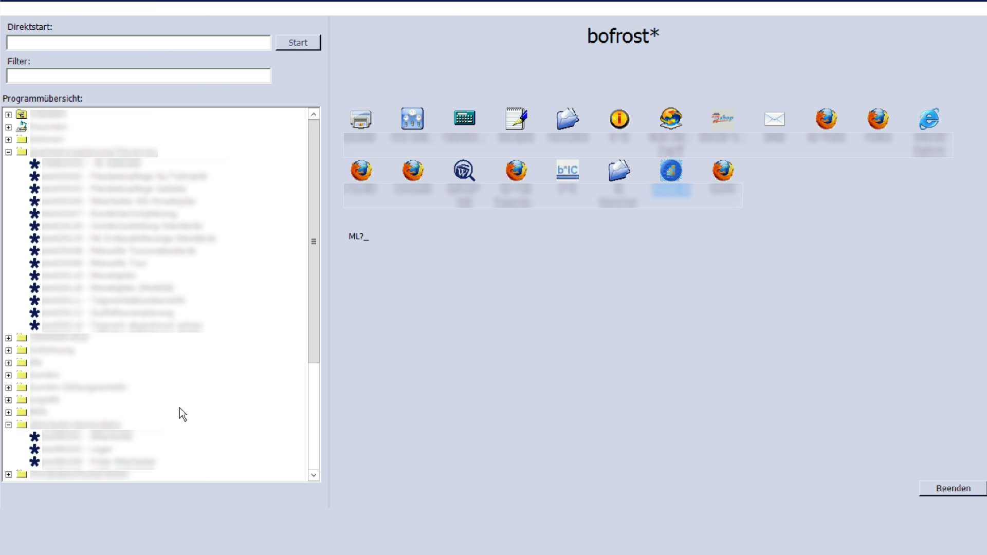
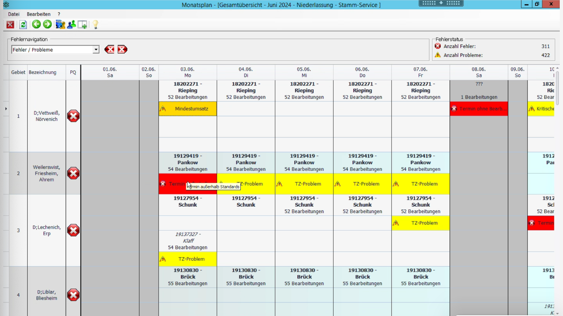
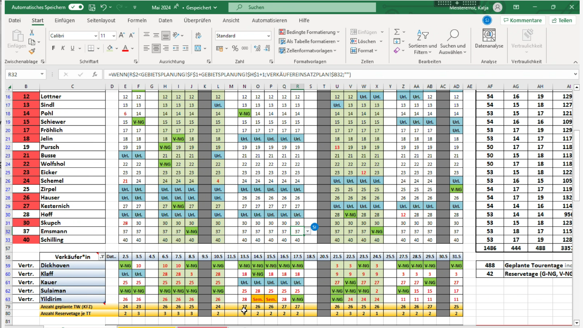
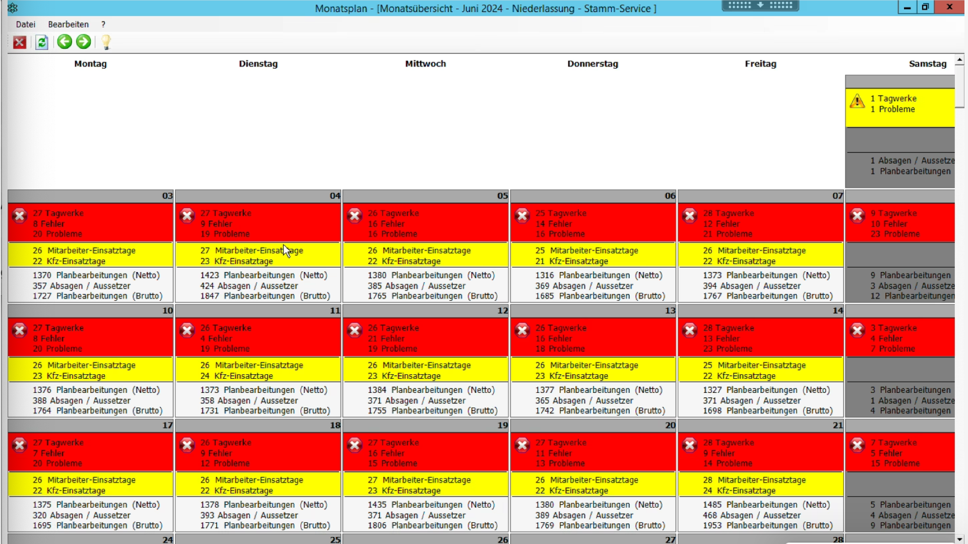
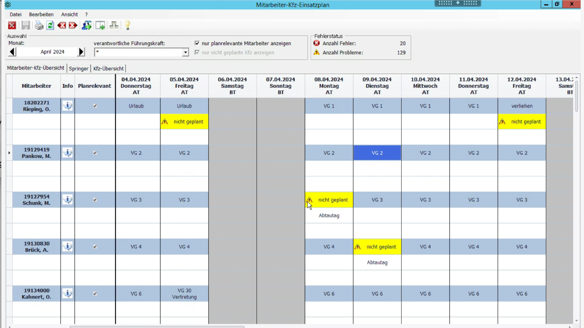
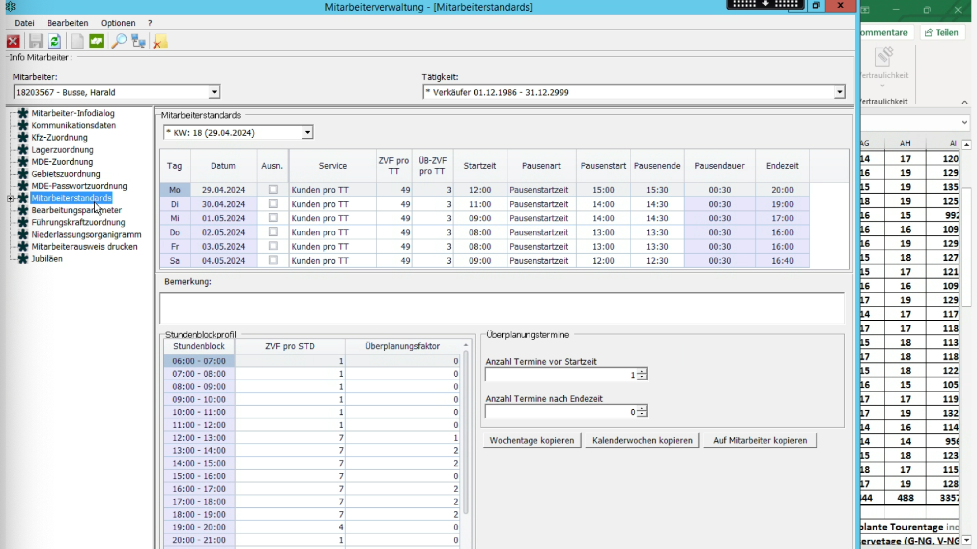
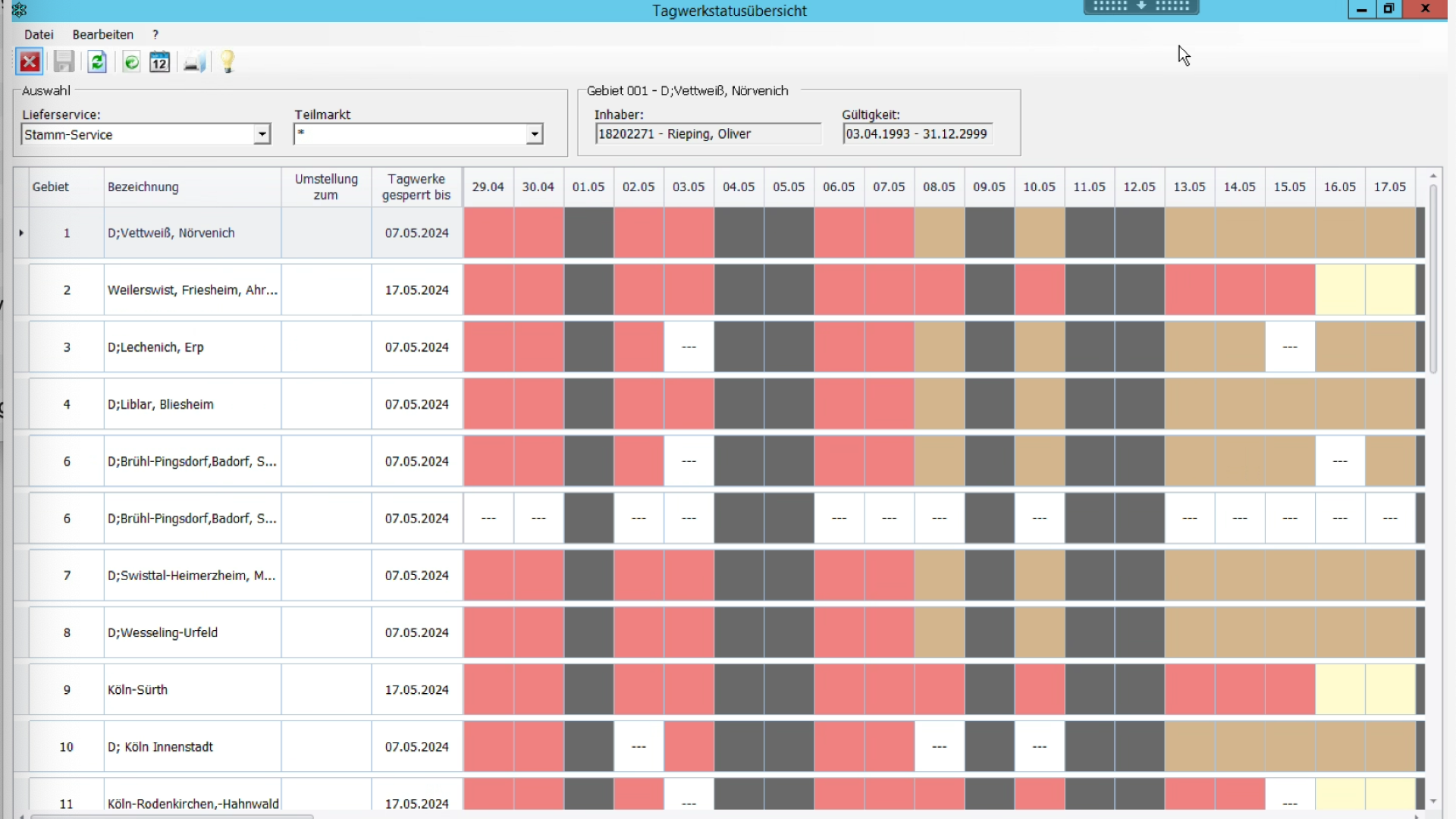
  2. 2.Product walkthroughs of the legacy software.
  3. 3.Prepare and run stakeholder interviews.
  4. 4.Customer journey mapping as the first building block.
  5. 5.Identify critical themes as the first UX-concept milestone.
  6. 6.Present outcomes with the client team and refine deliverables.

Second phase

  1. 1.UX Concept
  2. 2.UX Structure
  3. 3.Styleboards
  4. 4.UI Design (in sprints)
  5. 5.User testing
03. Introduction & Research

Stakeholder interviews and walkthroughs

Early work was deliberately wide: one-to-one interviews with people across the organisation, plus guided walkthroughs of the legacy software—each time from the stance of a specific role. That combination made it possible to hear how strategy, planning, coaching, field execution, and engineering talked past each other inside the same tool.

Interviews across the stakeholder map

I spoke with management, planners, coaches, regional leads, drivers, developers, and others. Each group brought different success metrics, time pressure, and blind spots—so the picture of “what planning work is” could not be reduced to a single persona or department.

Remote stakeholder interviews — video session (faces blurred for privacy)

Walkthroughs from multiple viewpoints

Beyond talk, I stepped through the live system with those same roles. Watching planners, coaches, or drivers drive the UI exposed where labels, flows, and handoffs meant one thing in headquarters and something else in the field—and where workarounds had become normal.

Live software walkthrough during a screen-share session

Design system outcomes

Faster build consistency

Shared components reduced duplicate UI work and made regressions easier to spot.

Clearer data hierarchy

Tables, filters, and primary actions followed one system—critical for dense logistics data.

04. Journey Mapping

Planner journeys, end to end

I mapped logistics journeys as sequences of decisions—not pages—so I could see where planners lost context, re-entered data, or escalated to workarounds. Below are the original wide-format journey maps—step through them with the controls to keep each map at full width and readable scale.

Planning (Planung)

1 / 3

Journey map: planning phase from Köbler list through VSS, appointment planning, and monthly review
05. Mapping input

Identified six critical themes

Pain points and friction from journey maps were combined with signals from interviews and software walkthroughs, then sorted into recurring themes so UX and engineering could argue from shared evidence, not scattered anecdotes.

User guidance

  • Unclear which steps belong to the active work step
  • Constant program switching instead of one coherent flow
  • No mandatory sequence to follow
  • No overview of completed vs. still-open tasks

Information architecture

  • Same tasks re-entered across tools
  • No centralized database with global access
  • Missing interfaces between programs and components
  • High- and low-frequency tools given equal hierarchy and priority

System feedback

  • No visibility into changes by other users or programs
  • No alerts for failures or when urgent action is needed
  • Active parameters not visible in the UI
  • Little contextual guidance in the interface

Customizability

  • Distinct needs across user groups
  • Permissions should adapt by role or experience level
  • UI content varies by group without a consistent model

Interfaces

  • Disconnected tools force duplicate work (state not shared)
  • No global data layer; siloed access
  • Handoff gaps between program boundaries and components

Automation

  • Heavy manual workload for planners
  • Feedback only when explicitly requested
  • Manual data upkeep remains error-prone
06. UX Concept & fundamentals

UX concept and fundamentals from critical themes

I turned the critical themes from research and validation into a UX concept with six pillars—Interfaces, Automation, Architecture, User guidance, System feedback, and Customizability—aligned with the concept map.

Interfaces

Principle

Connecting data across the system

Data should reach every place it is needed via explicit interfaces and technical foundations—not ad hoc copies or manual bridges.

Automation

Principle

Less manual work

Planned integrations should place data where it is needed automatically, removing repeated manual steps and reducing bad input.

Architecture

Principle

Search

Strong search reaches deep hierarchy fast (e.g. customers, drivers) without long navigation paths.

User guidance

Principle

Continuous status updates

Each step shows what is done, what is pending, and what comes next.

System feedback

Principle

Plain language

System copy (including errors): short words and terms planners already use.

Customizability

Principle

Relevance

Keep role-critical programs, data, and actions visible; hide what is rare or not allowed for that role.

07. Translating Use Cases to Architecture

From use cases to information architecture

Management requirements were mapped into screens, flow logic, and navigation structure.

  • Processed 30+ multi-page use-case documents.
  • Consolidated into 33 mapped end-to-end flows.
  • Derived applications, screen clusters, and navigation model from actual operations.

Von Use-Case-Unterlagen zur Umsetzung im System

Use-Case-Dokument — Auszug 146Use-Case-Dokument — Auszug 147Use-Case-Dokument — Auszug 148Use-Case-Dokument — Auszug 149Use-Case-Dokument — Auszug 150Use-Case-Dokument — Auszug 151
Wireflow: Kunden in BBV eintragen — Screens vom Homescreen über Meldungen und Dialoge bis zur Gebietszuordnung
BBV eintragen
Process repeated for 33 use cases
Informationsarchitektur: Startseite und Navigation mit den Hauptbereichen BBV, Kundendaten, Mitarbeiterdaten und Einstellungen — verknüpfte Screen-Mockups
08. UI Screens

Prepared UI screen gallery

These representative bo*flex screens show how the information architecture translated into day-to-day planner interfaces, balancing navigation clarity, operational density, and quick access to critical actions.

bo*flex dashboard screen with task list, updates, calendar, and planning modules
Dashboard and task orchestration view
Gebiete screen showing regional structure and assignment context in bo*flex
Delivery areas
Kundendaten screen with customer data structure and editing context in bo*flex
Customer data
Tagwerke screen with daily operations and scheduling context in bo*flex
Delivery routines

Boflex is a complex enterprise system with many modules and dozens of screens. The views shown here are selected excerpts that represent key interaction patterns and core operational contexts.

09. Iterating

Validating & Refining the Experience

Interactive prototypes replaced assumptions with evidence, and remote testing with planners and stakeholder feedback loops continuously improved flow quality.

  • Tested realistic planning tasks early in Figma.
  • Simplified table-heavy interactions and navigation logic.
  • Synced continuously with engineering for feasibility.
  • Reduced dependency on extensive manuals/training.
Remote usability test session in the Boflex Figma prototype with planning dialogs, table interactions, and navigation flow checks.
Figma Prototype used for remote user testing and stakeholder alignment.
10. Component Library

Enterprise Design System & Component Library

I built a UI component library that covered the full product surface: buttons, inputs, responsive grids, and—most critically—complex table logic for scanning, sorting, and bulk operations. The library became the contract between design and engineering: predictable specs, fewer edge-case surprises, and a coherent experience across every module.

A contract between design and engineering based on Material Design principles, ensuring predictable specs and a coherent experience.

Colors

Roboto / Title, Label, Body

Bofrost UI kit overview with navigation, forms, alerts, and table-related components
11. Results (Before & After)

From legacy complexity to a system-backed experience

Legacy planning

Legacy planning
  • 80+ stand-alone programs, each with its own entry point
  • Single-user locks and long jobs that blocked work for hours
  • Critical batch work pushed to evenings and overnight runs

Modern, system-backed UI

Modern, system-backed UI
  • One Boflex web product with shared navigation and modular flows
  • Shared access patterns instead of single-seat programs and overnight-only batch runs
  • Design-system-driven consistency across modules
Impact

Average time to complete recurring planning tasks improved dramatically after replacing 80+ legacy programs with one web product: IA from real use cases and mapped flows, plus a shared component library aligned with engineering, cut tool-switching and duplicate data entry—so planners finished routine work noticeably faster day to day.

More Projects